CUSUM Filter Visualized

Illya Gerasymchuk
CUSUM Filter Visualized
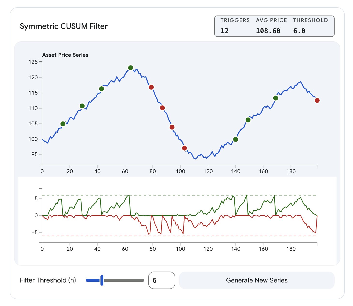
I’m looking into CUSUM Filters in more depth and just wanted to share this nice visualization that Gemini created to demonstrate graphically how the threshold affects the sampling/event emission for a price series.
In this example, price is used a the feature, but note that CUSUM works with any measured quantity